React Native Learnings
A full stack developer from India.
Html | Css | Javascript | React | Redux | Tailwind | Node | Express | Mongodb | Sql | Nosql | Socket.io
Here’s a proper structure for the README file based on the contents of your provided images:
React Native Learning Plan
Week 1: Introduction to React Native
What is React Native?
Getting Started: Setting up your environment.
Native Core Components:
Text
View
ScrollView
TextInput
Touchable
Pressable
FlatList
NestedList
Native Styling: Basics of styling components in React Native.
Platform-Dependent Code: Handling platform-specific code for iOS and Android.
Week 2: Advanced Basics
AsyncStorage: Local storage for React Native.
Modal: Creating modals in React Native.
Alert: Displaying alerts and dialogs.
API Calls: Working with external APIs.
SQLite: Local database integration.
React Native Architecture: Understanding the architecture.
React Native Security: Best practices for secure apps.
SQLite Task List Project with CRUD Operations: Hands-on mini-project.
Generate Distribution Ready Release APK for Android: Preparing the app for production.
Week 3: Navigation and Animations
Animated View: Animations in React Native.
Navigation:
Native Stack
Passing Parameters to Routes
Bottom Tab
Tab with Stack
Drawer Navigation
Bottom Tab with Drawer
Drawer with Bottom Tab and Stack Navigator
Most Used Packages Overview: Introduction to popular React Native libraries.
Using MobX: State management with MobX.
Using UI Libraries: Integration with popular UI kits.
Week 4: Native Features
Using Camera: Capturing images and videos.
Text-to-Speech:
- Basic Text-to-Speech App.
Using Sensor: Accessing device sensors.
Using Location: Working with GPS and maps.
Creating Step Count App: Building a fitness tracker app.
Responding to Gestures: Gesture handling and animations.
Week 5: Firebase and Deployment
Firebase Authentication: User login and registration.
Firebase Cloud Messaging: Push notifications.
Real-Time Database: Syncing data in real-time.
Simple Group Chat App: A full-featured chat app using Firebase.
Deploy to Google Play Store: Publishing the app.
LECTURE 1
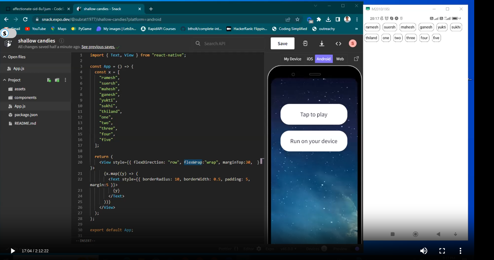
// app.js
import React from "react";
import { Text, View, Platform } from "react-native";
import styles from "./AppStyle";

const App = () => {
  return (
    <View style={{ ...styles.container, flexDirection: "row", width: "100%" }}>
      <Text style={{ ...styles.text, backgroundColor: "red", flex: 1 }}>
        Hello World 1
      </Text>
      <Text style={{ ...styles.text, backgroundColor: "pink", flex: 1 }}>
        Hello World 2
      </Text>
      <Text style={{ ...styles.text, backgroundColor: "blue", flex: 1 }}>
        Hello World 3
      </Text>
    </View>
  );
};

export default App;
// AppStyle.js
import { StyleSheet,Platform } from "react-native";

const styles = StyleSheet.create({
  container: {
    // providing Platform specific marginTop
    marginTop: Platform.select({android:45,web:0,ios:47}),
    // backgroundColor: "green",
    height: 50,
    width: 100,
    // border: "2px solid red",
  },
  text: {
    color: "#fff",
    padding: 10,
  },
});

export default styles;
//App.android.js
import React from "react";
import { Text, View, Platform } from "react-native";
import styles from "./AppStyle";

const App = () => {
  return (
    <View style={{ ...styles.container, flexDirection: "row", width: "100%" }}>
      <Text style={{ ...styles.text, backgroundColor: "red", flex: 1 }}>
        Hello World 1
      </Text>
      <Text style={{ ...styles.text, backgroundColor: "pink", flex: 1 }}>
        Hello World 2
      </Text>
      <Text style={{ ...styles.text, backgroundColor: "blue", flex: 1 }}>
        Hello World 3
      </Text>
    </View>
  );
};

export default App;
LECTURE 2
Native Elements 1
Controlled Components and Uncontrolled Components
In React, Controlled Components and Uncontrolled Components are two ways of handling form elements and their state.
Controlled Components
A controlled component is a form element (like
<input>,<textarea>, or<select>) whose value is controlled by React state.React manages the state of the input and updates the UI whenever the state changes.
These components rely on an explicit
valueprop and anonChangehandler to manage user input.
Key Features
React state is the "single source of truth."
Easier to integrate with business logic (validation, formatting, etc.).
The developer has complete control over the input’s value.
Example:
import React, { useState } from 'react';

const ControlledInput = () => {
  const [value, setValue] = useState('');

  const handleChange = (event: React.ChangeEvent<HTMLInputElement>) => {
    setValue(event.target.value);
  };

  return (
    <div>
      <input type="text" value={value} onChange={handleChange} />
      <p>Value: {value}</p>
    </div>
  );
};

export default ControlledInput;
Uncontrolled Components
An uncontrolled component manages its state internally without relying on React state.
The DOM itself handles the form element's state, and you access the value using a
ref.
Key Features
The input element's state is not tied to the React state.
Useful when migrating older codebases or dealing with non-React libraries.
Slightly harder to validate or manipulate user input programmatically.
Example:
import React, { useRef } from 'react';

const UncontrolledInput = () => {
  const inputRef = useRef<HTMLInputElement>(null);

  const handleSubmit = () => {
    if (inputRef.current) {
      alert(`Input value: ${inputRef.current.value}`);
    }
  };

  return (
    <div>
      <input type="text" ref={inputRef} />
      <button onClick={handleSubmit}>Submit</button>
    </div>
  );
};

export default UncontrolledInput;
Comparison Table
| Aspect | Controlled Components | Uncontrolled Components |
| State Management | Handled by React via useState or useReducer. | Handled by the DOM element itself. |
| Validation | Easier to perform on every change. | Requires manual extraction from the DOM. |
| Code Complexity | Slightly more code but predictable. | Less code but less React-centric. |
| Use Case | When you need tight control over input or validation logic. | For simple forms or integrating legacy code. |
In modern React applications, controlled components are preferred because they align with React's declarative approach and offer better control over the UI and data flow.
react native code
import React, {useState} from "react";
import { SafeAreaView, StyleSheet, TextInput, Platform,TouchableOpacity, Text } from "react-native";

const App = () => {
  const [text, setText] = useState("");
  const [number, onChangeNumber] = useState("");

  const onTap = (val) =>{
    console.log("val", val);
    setText(val);
  }

  return (
    <SafeAreaView style={styles.container}>
      <TextInput
        style={styles.input}
        onChangeText={(text)=>onTap(text)}
        value={text}
        placeholder={"Enter Name"}
      />
      <TextInput
        style={styles.input}

        value={number}
        // another way of updating state directly using onChangeText
        onChangeText={onChangeNumber}
        placeholder="Enter Age"
        keyboardType="numeric"
      />
      <TouchableOpacity onPress={() => alert(`${text} - ${number} `)} style={styles.button}>
        <Text style={styles.btnText}>SUBMIT</Text>
      </TouchableOpacity>
    </SafeAreaView>
  );
};

const styles = StyleSheet.create({
  container : {
    marginTop: Platform.OS === "android" ? 50 : 0
  },
  input: {
    height: 40,
    margin: 12,
    borderWidth: 1,
    borderRadius: 5,
    padding: 10,
  },
  button:{
    backgroundColor:'red',
    marginHorizontal:10,
    borderRadius:5,
    padding:5,
    alignItems:'center'
  },
  btnText:{
    color:'#FFF'
  }
});

export default App;
A foundational component for inputting text into the app via a keyboard. Props provide configurability for several features, such as auto-correction, auto-capitalization, placeholder text, and different keyboard types, such as a numeric keypad.
Porps:
onSubmitEditing: onSubmitEditing is triggered when you click the text input submit button (keyboard button).
event.nativeEvent.textwill give the value of input.onChangeText: onChangeText is triggered when you type anything in the text input. Its typical use to update the state of Component with TextInput value like Reactjs onChange event.
placeHolder
placeHolderTextColor
onPressIn: Callback that is called when a touch is engaged.
onPressOut: Callback that is called when a touch is released.
onFocus: Callback that is called when the text input is focused.
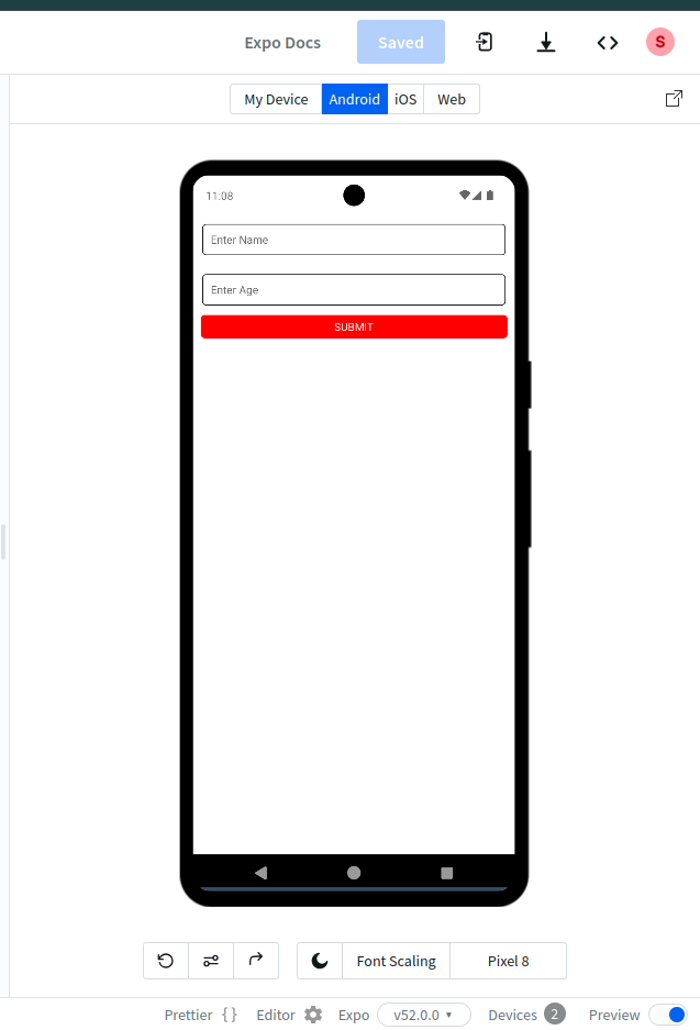
output
Lecture 3 Native Elements 2
// In React Native , Instead of writing as
marginLeft : 10,
marginRight:10

// we can write as
marginHorizontal: 10

// Instead of writing
marginTop :20,
marginBottom : 20

// we can also write as
marginVertical :20
code example with handling image
import React from 'react'
import { View, Image, StyleSheet } from 'react-native'
import snackIcon from './assets/snack-icon.png'

const App = () => {
  return(<View>
    <Image source={{uri:"https://cdn.pixabay.com/photo/2021/11/22/05/02/dalmatian-6815838_960_720.jpg"}} style={styles.roundImage}/>
    <Image source={require('./assets/snack-icon.png')} style={styles.squareImage}/>
    <Image source={snackIcon} style={styles.squareImage}/>
  </View>)
}

export default App;

const styles = StyleSheet.create({
  squareImage : {
    width:100,
    height:100,
    borderRadius:10
  },
  roundImage: {
    width:100,
    height:100,
    borderRadius:'50%'
  }
})
Image Props
source: specifies source of the image
resizeMode: Determines how to resize the image when the frame doesn't match the raw image dimensions. Value of this prop can be any one of the following. The default is
covercover: Scale the image uniformly (maintain the image's aspect ratio) so that both dimensions (width and height) of the image will be equal to or larger than the corresponding dimension of the view (minus padding). at least one dimension of the scaled image will be equal to the corresponding dimension of the view (minus padding).
Map: Scale the image uniformly (maintain the image's aspect ratio) so that both dimensions (width and height) of the image will be equal to or less than the corresponding dimension of the view (minus padding).
stretch: Fit the width and height of image to mentioned width and height, This may change the aspect ratio.
repeat: Repeat the image to cover the frame of the view. The image will keep its size and aspect ratio, unless it is larger than the view, in which case it will be scaled down uniformly so that it is contained in the view.
center: Center the image in the view along both dimensions. If the image is larger than the view, scale it down uniformly so that it is contained in the view.
HANDLING VERTICAL AND HORIZONTAL SCROLL
import React, {useState} from 'react'
import {ScrollView,View, Text, StyleSheet, Button} from 'react-native'
import  Constants  from 'expo-constants'


const App = () => {
  const [data, setData] = useState([])

  const addItem = () => {
    setData(prev => [...prev, 'item '+Math.ceil(Math.random()*100)]);
  }
  return(<View style={styles.container}>
    <Button title="Add Item" onPress={addItem}/>
    <Text style={styles.heading}>List of Items</Text>
     <ScrollView >
     // to get horizontal scroll you can use <ScrollView horizontal> </ScrollView>
    {data.map(item => (<Text style={styles.item}>{item}</Text>))}
    {data.length == 0 && <Text style={{textAlign:'center'}}>No Items in list</Text>}
    </ScrollView>
  </View>)
}

export default App;

const styles = StyleSheet.create({
  container : {
    marginTop: Constants.statusBarHeight
  },
  item : {
    borderRadius:10,
    borderWidth:1,
    padding:5,
    margin:5,
  },
  heading : {
    fontSize: 25,
    fontWeight: 'bold',
    textAlign:'center'
  }
})
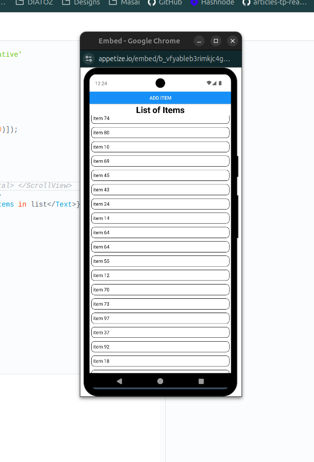
below image will scroll vertically
to get horizontal scroll you can use
<ScrollView horizontal> </ScrollView>
Note : The ScrollView works best to present a small number of things of a limited size. All the elements and views of a ScrollView are rendered, even if they are not currently shown on the screen. If you have a long list of items which cannot fit on the screen, you should use a FlatList instead.
Before moving to FlatList let us find out, How to attach a pull to refresh to our ScrollView.
REFRESHCONTROL , PULL TO REFRESH
Pull to Refresh
RefreshControl component is used inside a ScrollView to provide pull to refresh functionality.
most used props
onRefresh: Function to be executed when the ScrollView is pulled down.
refreshing : when true displays spinner. So at the beginning of
onRefreshmethod set it true then at the end set it false.colors: on Android sets the spinner color
tintColor: on IOS sets the spinner color
import React, {useState} from 'react'
import {View, Text, StyleSheet, RefreshControl, ScrollView} from 'react-native'
import  Constants  from 'expo-constants'

const App = () => {
  const [data, setData] = useState([])
  const [refreshing, setRefreshing] = React.useState(false);

  const onRefresh = () => {
    setRefreshing(true) ;
    setData(prev => [...prev, 'item '+Math.ceil(Math.random()*100)]);
    setRefreshing(false);
  }
  return(
    <View style={styles.container}>
      <Text style={styles.heading}>List of Items</Text>
      <ScrollView
    refreshControl={<RefreshControl refreshing={refreshing} onRefresh={onRefresh} colors={['red']} tintColor='green' />}
  >
    {data.map(item => (<Text style={styles.item}>{item}</Text>))}
    {data.length == 0 && <Text style={{textAlign:'center'}}>No Items in list</Text>}
    </ScrollView>
  </View>)
}

export default App;

const styles = StyleSheet.create({
  container :{
    marginTop: Constants.statusBarHeight
  },
  item : {
    borderRadius:10,
    borderWidth:1,
    padding:5,
    margin:5,
  },
  heading : {
    fontSize: 25,
    fontWeight: 'bold',
    textAlign:'center'
  }
})
As this task ends quickly so you may not see the spinner properly. While getting data from server you may see it properly. To test it now letus create a function which intentionaly delay the process, so that we can see the spinner.
  const wait = (timeout) => {
    return new Promise(resolve => setTimeout(resolve, timeout));
  }

  const onRefresh = () => {
    setRefreshing(true) ;
    setData(prev => [...prev, 'item '+Math.ceil(Math.random()*100)]);
    wait(2000).then(() => setRefreshing(false));
  }
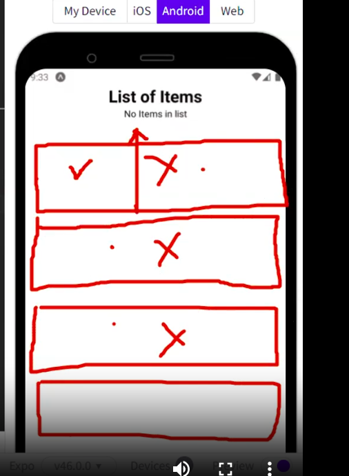
TASK
// create a image gallery that have 4 to 5 images, havigng scrollview,
// on pressing on an imange will delete it
// but if i pull it for refresh then after refresh all the image will come
it should be like this
// Solution
import React, {useState} from "react";
import { SafeAreaView,Text ,StyleSheet,Platform , Image, ScrollView,TouchableOpacity,Button,RefreshControl} from "react-native";
import {images} from "./assets/utils";
// create a image gallery that have 4 to 5 images, having scrollview,
// pressing on an imange will delete it
// but if i pull it for refresh then after refresh all the image will come

const App = () =>{
  const [initialImage, setInitialState] = useState(images || []);
    const [refreshing, setRefreshing] = React.useState(false);
  const removeImage = (imageToBeRemoved) =>{
    // remove image from initialImage state
   const updatedImage =  initialImage.filter((image)=>{
      return image !== imageToBeRemoved
    })
    setInitialState(updatedImage)
  }
  const onRefresh = () =>{
    setRefreshing(true);
    setInitialState(images);
    setRefreshing(false);
  }
  return (
    <SafeAreaView style={styles.parent}>
    <Text style ={{textAlign:"center"}}> Image Slider App </Text>
{/*
    <Button title="Show all Images" onPress={()=>{
      setInitialState(images)
    }}/>
*/}
    <ScrollView  refreshControl = {<RefreshControl refreshing= {refreshing}  onRefresh={onRefresh} colors={['red']} tintColor='green' />}>


{initialImage.map((image, index) => (
  <TouchableOpacity onLongPress={() => removeImage(image)}>
  <Image  source={{ uri: image }} key={index} style={{ width: 400, height: 160 }} center />
  </TouchableOpacity>
))}

</ScrollView>
    </SafeAreaView>
  )
}

export default App;

const styles = StyleSheet.create({
  parent:{
       marginTop: Platform.select({android:45,web:5,ios:47})
  }
})

// images array value
export const images = [
  "https://cdn.pixabay.com/photo/2024/11/21/22/06/deer-9214838_640.jpg",
  "https://cdn.pixabay.com/photo/2024/12/28/01/27/ai-generated-9295105_640.jpg",
  "https://cdn.pixabay.com/photo/2024/11/11/09/47/winter-9189662_640.jpg",
  "https://cdn.pixabay.com/photo/2022/06/26/12/48/animal-7285346_640.jpg",
  "https://cdn.pixabay.com/photo/2024/04/08/22/31/forest-8684668_640.jpg",
  "https://cdn.pixabay.com/photo/2022/12/11/13/21/baby-7648901_640.jpg"
]
Lecture 4 Native Elements 3
import React from 'react';
import {View, Text, FlatList} from 'react-native';

const App = () =>{


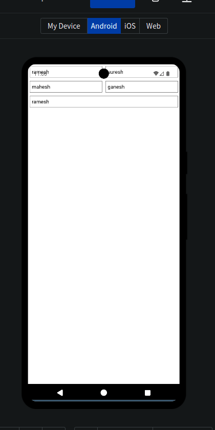
const data = ["ramesh","suresh","mahesh","ganesh","ramesh"]

const item = ({item}) =>{
  return (<Text style ={{flex:1 , borderWidth : 0.5, paddingVertical : 5, paddingHorizontal :5, margin : 5}} >{item}</Text>)
}

// flex : 1
return (<View>
 <FlatList
  data ={data}
  // it will render only those items that will be visible on the screen
  renderItem={item}
  // keyExtractor will be used to extract key, it gives us item and index just like map.
  // keyExtractor accepts the string value, that's why converting it toString()
  keyExtractor = {(item, index)=> index.toString()}

  // using numColumns you can define the number of columns required
  numColumns={2}

  />


</View>)

}

export default App;
Output
export const data = [
  {
    id: 1,
    title: "Fjallraven - Foldsack No. 1 Backpack, Fits 15 Laptops",
    price: 109.95,
    description: "Your perfect pack for everyday use and walks in the forest. Stash your laptop (up to 15 inches) in the padded sleeve, your everyday",
    category: "men's clothing",
    image: "https://fakestoreapi.com/img/81fPKd-2AYL._AC_SL1500_.jpg",
    rating: {
      rate: 3.9,
      count: 120
    }
  },
  {
    id: 2,
    title: "Mens Casual Premium Slim Fit T-Shirts ",
    price: 22.3,
    description: "Slim-fitting style, contrast raglan long sleeve, three-button henley placket, light weight & soft fabric for breathable and comfortable wearing. And Solid stitched shirts with round neck made for durability and a great fit for casual fashion wear and diehard baseball fans. The Henley style round neckline includes a three-button placket.",
    category: "men's clothing",
    image: "https://fakestoreapi.com/img/71-3HjGNDUL._AC_SY879._SX._UX._SY._UY_.jpg",
    rating: {
      rate: 4.1,
      count: 259
    }
  },
  {
    id: 3,
    title: "Mens Cotton Jacket",
    price: 55.99,
    description: "great outerwear jackets for Spring/Autumn/Winter, suitable for many occasions, such as working, hiking, camping, mountain/rock climbing, cycling, traveling or other outdoors. Good gift choice for you or your family member. A warm hearted love to Father, husband or son in this thanksgiving or Christmas Day.",
    category: "men's clothing",
    image: "https://fakestoreapi.com/img/71li-ujtlUL._AC_UX679_.jpg",
    rating: {
      rate: 4.7,
      count: 500
    }
  },
  {
    id: 4,
    title: "Mens Casual Slim Fit",
    price: 15.99,
    description: "The color could be slightly different between on the screen and in practice. / Please note that body builds vary by person, therefore, detailed size information should be reviewed below on the product description.",
    category: "men's clothing",
    image: "https://fakestoreapi.com/img/71YXzeOuslL._AC_UY879_.jpg",
    rating: {
      rate: 2.1,
      count: 430
    }
  },
  {
    id: 5,
    title: "John Hardy Women's Legends Naga Gold & Silver Dragon Station Chain Bracelet",
    price: 695,
    description: "From our Legends Collection, the Naga was inspired by the mythical water dragon that protects the ocean's pearl. Wear facing inward to be bestowed with love and abundance, or outward for protection.",
    category: "jewelery",
    image: "https://fakestoreapi.com/img/71pWzhdJNwL._AC_UL640_QL65_ML3_.jpg",
    rating: {
      rate: 4.6,
      count: 400
    }
  },
  {
    id: 6,
    title: "Solid Gold Petite Micropave ",
    price: 168,
    description: "Satisfaction Guaranteed. Return or exchange any order within 30 days.Designed and sold by Hafeez Center in the United States. Satisfaction Guaranteed. Return or exchange any order within 30 days.",
    category: "jewelery",
    image: "https://fakestoreapi.com/img/61sbMiUnoGL._AC_UL640_QL65_ML3_.jpg",
    rating: {
      rate: 3.9,
      count: 70
    }
  },
  {
    id: 7,
    title: "White Gold Plated Princess",
    price: 9.99,
    description: "Classic Created Wedding Engagement Solitaire Diamond Promise Ring for Her. Gifts to spoil your love more for Engagement, Wedding, Anniversary, Valentine's Day...",
    category: "jewelery",
    image: "https://fakestoreapi.com/img/71YAIFU48IL._AC_UL640_QL65_ML3_.jpg",
    rating: {
      rate: 3,
      count: 400
    }
  },
  {
    id: 8,
    title: "Pierced Owl Rose Gold Plated Stainless Steel Double",
    price: 10.99,
    description: "Rose Gold Plated Double Flared Tunnel Plug Earrings. Made of 316L Stainless Steel",
    category: "jewelery",
    image: "https://fakestoreapi.com/img/51UDEzMJVpL._AC_UL640_QL65_ML3_.jpg",
    rating: {
      rate: 1.9,
      count: 100
    }
  },
  {
    id: 9,
    title: "WD 2TB Elements Portable External Hard Drive - USB 3.0 ",
    price: 64,
    description: "USB 3.0 and USB 2.0 Compatibility Fast data transfers Improve PC Performance High Capacity; Compatibility Formatted NTFS for Windows 10, Windows 8.1, Windows 7; Reformatting may be required for other operating systems; Compatibility may vary depending on user’s hardware configuration and operating system",
    category: "electronics",
    image: "https://fakestoreapi.com/img/61IBBVJvSDL._AC_SY879_.jpg",
    rating: {
      rate: 3.3,
      count: 203
    }
  },
  {
    id: 10,
    title: "SanDisk SSD PLUS 1TB Internal SSD - SATA III 6 Gb/s",
    price: 109,
    description: "Easy upgrade for faster boot up, shutdown, application load and response (As compared to 5400 RPM SATA 2.5” hard drive; Based on published specifications and internal benchmarking tests using PCMark vantage scores) Boosts burst write performance, making it ideal for typical PC workloads The perfect balance of performance and reliability Read/write speeds of up to 535MB/s/450MB/s (Based on internal testing; Performance may vary depending upon drive capacity, host device, OS and application.)",
    category: "electronics",
    image: "https://fakestoreapi.com/img/61U7T1koQqL._AC_SX679_.jpg",
    rating: {
      rate: 2.9,
      count: 470
    }
  }
]


// code
import React from 'react';
import {View, Text, FlatList, ListEmptyComponent,Image, Platform} from 'react-native';
import {data } from "./utils/data";

const App = () =>{


// const data = ["ramesh","suresh","mahesh","ganesh","ramesh"]
// const data = [];

const item = ({item}) =>{
  return (
    <View style = {{width:200, textAlign:'center', marginBottom: 10, marginEnd:10, marginTop:5 }}>


 <View style={{ flex: 1, justifyContent: 'center', alignItems: 'center' }}>
  <Image
    source={{ uri: `${item.image}` }}
    style={{ width: 150, height: 150, borderRadius: 25, marginTop: 5, marginBottom: 5 }}
  />
</View>

        <Text style ={{flex:1 , paddingVertical : 5, paddingHorizontal :5, margin : 5}} >{item.title}</Text>
        <Text style={{textAlign:'center'}}>Rs {item.price}</Text>

    </View>
    )

}

// flex : 1
return (<View style={{marginTop: Platform.select({ android: 50, ios: 20 })}}>
 <FlatList
  data ={data}
  // it will render only those items that will be visible on the screen
  renderItem={item}


  keyExtractor = {(item, index)=> index.toString()}

  // using numColumns you can define the number of columns required
  numColumns={2}

  ListEmptyComponent = {()=> <Text style={{textAlign:'center'}}>No Items Found!</Text>}
  ListHeaderComponent={() => <Text style={{textAlign:'center'}}>This is header of FlatList   </ Text>}
  ListFooterComponent={() => <Text  style={{textAlign:'center'}}>This is footer of FlatList</Text>}
  />


</View>)

}

export default App;
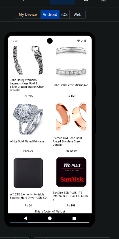
Output
https://snack.expo.dev/@suryaddddddd/class-4-part-1-flatlist
//  Some better readable code for same solution
import React from 'react';
import {
  View,
  Text,
  FlatList,
  Image,
  Platform,
  Dimensions,
  StyleSheet,
} from 'react-native';
import { data } from './utils/data';

const { width } = Dimensions.get('window'); // Get screen width

const App = () => {
  const item = ({ item }) => {
    return (
      <View style={styles.itemContainer}>
        <View style={styles.imageWrapper}>
          <Image
            source={{ uri: `${item.image}` }}
            style={styles.image}
          />
        </View>
        <Text style={styles.title}>{item.title}</Text>
        <Text style={styles.price}>Rs {item.price}</Text>
      </View>
    );
  };

  return (
    <View style={styles.container}>
      <FlatList
        data={data}
        // it will render only those items that will be visible on the screen
        renderItem={item}
        // keyExtractor will be used to extract key, it gives us item and index just like map.
       // keyExtractor accepts the string value, that's why converting it toString()
        keyExtractor={(item, index) => index.toString()}
        numColumns={2} // Number of columns in the grid
        ListEmptyComponent={() => <Text style={styles.emptyText}>No Items Found!</Text>}
        ListHeaderComponent={() => <Text style={styles.headerFooterText}>This is header of FlatList</Text>}
        ListFooterComponent={() => <Text style={styles.headerFooterText}>This is footer of FlatList</Text>}
      />
    </View>
  );
};

const styles = StyleSheet.create({
  container: {
    marginTop: Platform.select({ android: 50, ios: 20 }),
    flex: 1,
    backgroundColor: '#f9f9f9',
  },
  itemContainer: {
    width: (width / 2) - 20, // Dynamic width for 2 columns with margin
    marginBottom: 10,
    marginHorizontal: 5,
    backgroundColor: '#fff',
    borderRadius: 10,
    overflow: 'hidden',
    elevation: 2, // Shadow for Android
    shadowColor: '#000', // Shadow for iOS
    shadowOffset: { width: 0, height: 2 },
    shadowOpacity: 0.1,
    shadowRadius: 5,
  },
  imageWrapper: {
    flex: 1,
    justifyContent: 'center',
    alignItems: 'center',
    padding: 10,
  },
  image: {
    width: '100%',
    height: 150,
    borderRadius: 10,
    resizeMode: 'cover',
  },
  title: {
    fontSize: 16,
    fontWeight: '600',
    textAlign: 'center',
    marginVertical: 5,
  },
  price: {
    fontSize: 14,
    color: '#555',
    textAlign: 'center',
    marginBottom: 5,
  },
  emptyText: {
    textAlign: 'center',
    color: '#999',
    fontSize: 16,
    marginTop: 20,
  },
  headerFooterText: {
    textAlign: 'center',
    fontSize: 18,
    fontWeight: 'bold',
    marginVertical: 10,
  },
});

export default App;
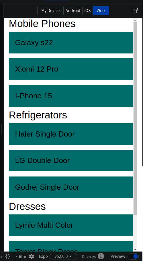
Section List in React Native
import React from "react";
import { StyleSheet, Text, View, SafeAreaView, SectionList, StatusBar } from "react-native";

const DATA = [
  {
    category: "Mobile Phones",
    data: ["Galaxy s22", "Xiomi 12 Pro", "I-Phone 15"]
  },
  {
    category: "Refrigerators",
    data: ["Haier Single Door", "LG Double Door", "Godrej Single Door"]
  },
  {
    category: "Dresses",
    data: ["Lymio Multi Color", "Toplot Black Dress", "Keri Perry"]
  },
];

const App = () => (
  <SafeAreaView style={styles.container}>
    <SectionList
      sections={DATA}
      keyExtractor={(item, index) => item + index}
      renderItem={({ item }) => <View style={styles.item}>
                                  <Text style={styles.title}>{item}</Text>
                                </View>}
      renderSectionHeader={({ section }) => (
        <Text style={styles.header}>{section.category}</Text>
      )}
    />
  </SafeAreaView>
);

const styles = StyleSheet.create({
  container: {
    flex: 1,
    paddingTop: StatusBar.currentHeight,
    marginHorizontal: 16
  },
  item: {
    backgroundColor: "#006666",
    padding: 20,
    marginVertical: 8,
    flexDirection:'row'
  },
  header: {
    fontSize: 32,
    backgroundColor: "#fff"
  },
  title: {
    fontSize: 24
  }
});

export default App;
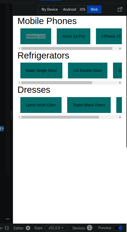
Section List With Columns
import React from "react";
import { StyleSheet, Text, View, SafeAreaView, SectionList, StatusBar, FlatList } from "react-native";

const DATA = [
  {
    category: "Mobile Phones",
    data: [{list:["Galaxy s22", "Xiomi 12 Pro", "I-Phone 15"]}]
  },
  {
    category: "Refrigerators",
    data: [{list:["Haier Single Door", "LG Double Door", "Godrej Single Door"]}]
  },
  {
    category: "Dresses",
    data: [{list:["Lymio Multi Color", "Toplot Black Dress", "Keri Perry"]}]
  },
];

const App = () => (
  <SafeAreaView style={styles.container}>
    <SectionList
      sections={DATA}
      keyExtractor={(item, index) => item + index}
      renderItem={({ item }) => < FlatList horizontal data={item.list} renderItem={({item})=><Text style={styles.item}>{item}</Text>}/>}
      renderSectionHeader={({ section: { category } }) => (
        <Text style={styles.header}>{category}</Text>
      )}
    />
  </SafeAreaView>
);

const styles = StyleSheet.create({
  container: {
    flex: 1,
    paddingTop: StatusBar.currentHeight,
    marginHorizontal: 16
  },
  item: {
    backgroundColor: "#006666",
    padding: 20,
    marginVertical: 8,
    flexDirection:'row',
    margin:10
  },
  header: {
    fontSize: 32,
    backgroundColor: "#fff"
  }
});

export default App;
Note: Remember FlatList and SectionList both are PureComponents which means that it will not re-render if props remain shallow-equal.
Icons
@expo/vector-icons or react-native-vector-icons can be used to include popular icon sets in our app. @expo/vector-icons is built on top of react-native-vector-icons and uses similar API.
https://oblador.github.io/react-native-vector-icons/ can be used to search for any icon. The icon sets are AntDesign, Entypo, EvilIcons,Feather, FontAwesome, FontAwesome5, FontAwesome5Brands, Fontisto, Foundation, Ionicons, MaterialCommunityIcons, MaterialIcons, Octicons, SimpleLineIcons, Zocial.
import * as React from 'react';
import { View, StyleSheet } from 'react-native';
import Ionicons from '@expo/vector-icons/Ionicons';

export default function App() {
  return (
    <View style={styles.container}>
      <Ionicons name="md-checkmark-circle" size={32} color="green" />
      <Ionicons name="eye-off" size={32} color="green" />
      <Ionicons name="fast-food" size={32} color="green" />
      <Ionicons name="finger-print" size={32} color="green" />
    </View>
  );
}

const styles = StyleSheet.create({
  container: {
    flex: 1,
    justifyContent: 'center',
    alignItems: 'center',
  },
});
LECTURE -5 Storage and API Integration
ASYNC STORAGE → async storage is used to store locally,
Async Storage
unencrypted, Asynchronous, Persistent, key-value storage system
Global Local Storage
Offline Local Storage
can only store string data
To store object use
JSON.stringify()while storing andJSON.parse()after reading.Don't use it to store secrets
AsyncStorage is not shared between multiple apps. Every app runs it it's own sandbox environment and has no access to other apps
core component is deprecated, use npm package: @react-native-async-storage/async-storage